Green is a derivative colour, created by mixing yellow and blue. Green colours are elegant, universal and clear. Green colour contributes to a safety feeling as well as balance and concentration. It relaxes, relieves and calms down. It’s especially useful in busy premises. It improves the heart condition, establishes blood circulation and enables to breath deeply. Pure and spotless green plays a role of balanced colour. Green may be either warm or cold, beginning from pistachio through to saturated colours of grass, malachite, olives and coniferous trees. It’s recommended for those who are excessively active, and have difficulties in making decisions as well as maintaining clarity of thought. It improves optimism, faith in one’s life and other people. It’s not recommended for those who need some stamina since it contributes to boredom, passiveness and slowness.
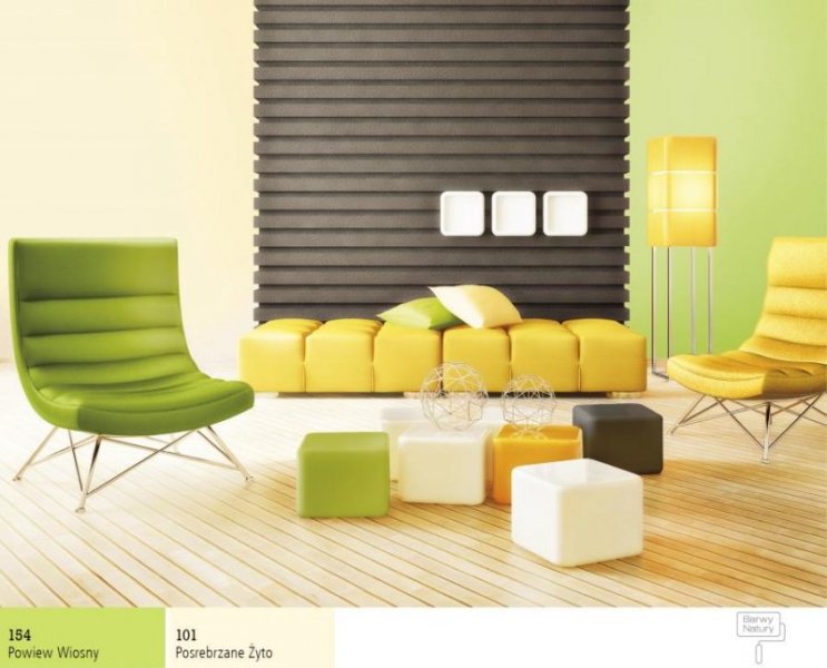
An interesting solution might be a combination of two green colours from a soft vivid palette.
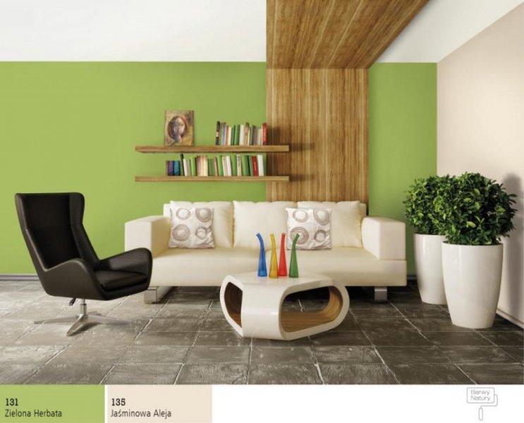
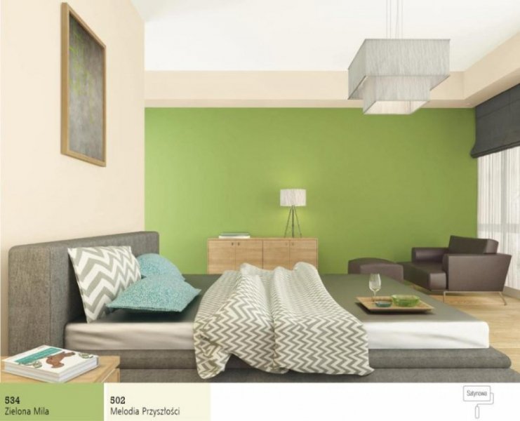
It’s worth applying subtle bright green colours in bedrooms since they ideally influence on rest. They are also perfect for studies since they stimulate memory. It’s worth combining such green colours with white, cream and ivory and delicate yellow. In combination with wooden furniture, the premises look fantastic. Additionally, if we paint the furniture with colourful stain, we will obtain an ideal and original style. In order to emphasise gentle green colours, we can combine them with turquoise or pink, as an ideal combination for children’s room.
Dark green colours create incredible mood and depth within the premises. As they are intense colours it’s better to use them as decorative supplement by painting the only one wall with the same shade, for example, or 10 centimetre stripe right under the ceiling, going round the room. This green ideally harmonizes with pink, light and dark yellow as well as light blue. Intense combination can be obtained by combining vivid red, orange and brown. This colour combinations can be applied in halls, for example.
Green used on facade of the house, allows the house to integrate into the quiet garden and during winter days resembles perfect summer time. This facade can be contrasted in an interesting way by combining red or yellow, for example, painting the roof, doors and window frames.
Turquoise is a green colour with more blue admixture. It’s worth combining it with light pink and grey, and emphasising by using orange or brown.
Olive is a green colour with more yellow. It can be combined with brown and light blue and emphasised by violet and red.