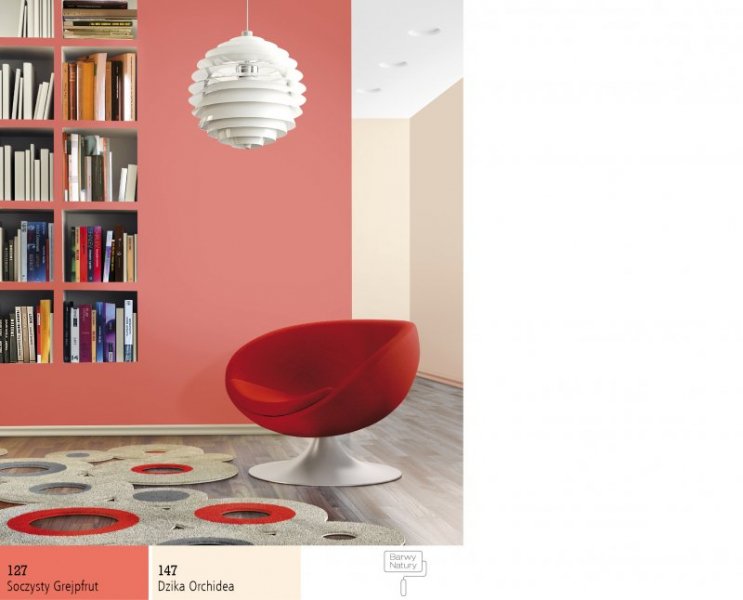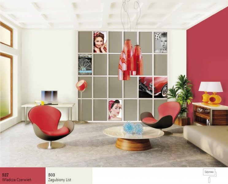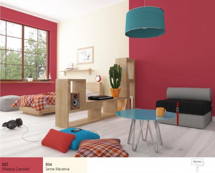
Red is a principle red colour and belongs to warm colours. It enhances physical activity, inspires, contributes to a good mood. It stimulates the heart condition as well as blood circulation, strengthens the body and increases its strength. Red is vivid, visible and stimulant and gives the premises more character. It’s recommended for exhausted and tired persons as well as those who have lost the power of fight, willing to succeed and experience new things. It’s not recommended for those who suffer from chronic tiredness, high blood pressure and persons who are exposed to stress.
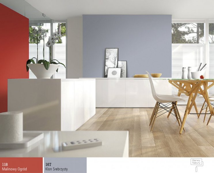
Intense and deep red diminishes optically the premises and influences the space strongly. It’s especially useful in the form of colourful palms and strong features inside of premises. It’s an ideal colour to be applied in halls and corridors. Though, it shouldn’t be applied in premises where concentration is required. Red increases appetite so it’s worth applying it in the kitchen and dining room also in subtle and gentle shades. Light red shades give the premises a feeling of warmth, ideal for bedrooms and children’s rooms. It’s pleasant to live and rest. It’s worth combining more gentle shades with yellow and green as well as light blue and green as ideal combination for children. Strong vivid red integrates ideally with light blue and grey, cream and brown, contrasts with green, yellow and light blue.
Red facade of the house makes impression of strong family bonds and contrasts interestingly with the garden. It can also be completed by brown roof and window shutters.